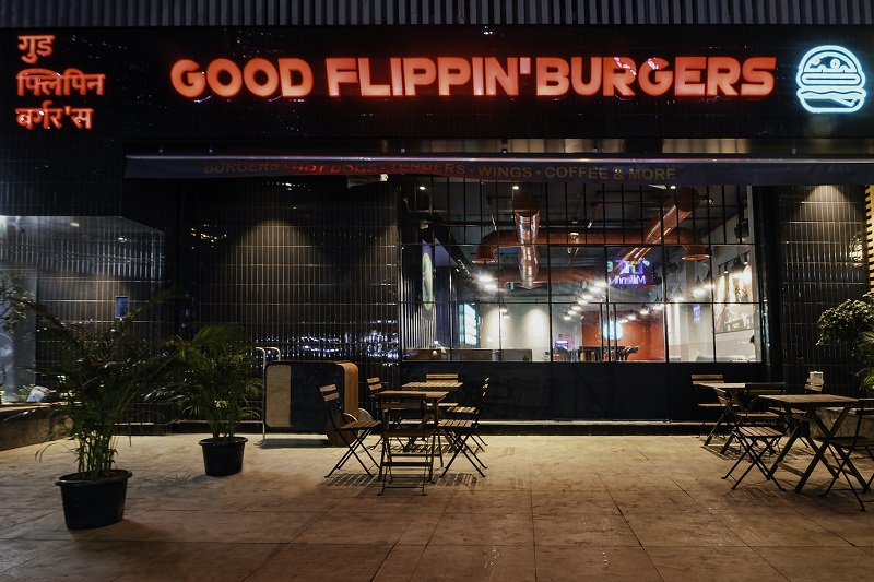
Deksha Design Studio, a renowned design firm based in Mumbai, has recently completed a flagship restaurant design project for Good Flippin’ Burgers at Malad. The primary goal of this endeavor for GFB was to create their mark in the dine-in concept restaurants from being a forerunner in the cloud kitchen space.
Design Concept:
The design concept was designed to interpret an industrial yet fun and eclectic vibe that reinforces GFB’s brand and gives the customers something that they haven’t seen before. The concept post understanding the brief of the client was to create a family friendly casual dine-in flagship restaurant that reflects the identity of the brand and its impact that it wants to create on society. The entire process was about designing the customer experience at the store whether it be their first impression of the store from the outside or the ordering experience that is super interactive or whether it be the fun thoughtful elements and their careful positioning all across the restaurant that add a fun, thoughtful yet eclectic vibe to the entire space.
Design style:
The design style is one that makes the space industrial yet modern with the pops of colours that create an element of surprise and direction to help create various instagrammable elements across the restaurant. The approach is defined by clean, straight lines that not only lend a modern aesthetic but also optimize space efficiently. Moreover, the commitment to creating a warm and welcoming atmosphere results in the interiors that feel inviting and comfortable. The ability to curate soothing environments tailored to the users’ needs is a testament of Deksha’s dedication to providing functional yet aesthetically pleasing designs that enhance the overall experience.
Materials:
Deksha Design Studio carefully curated a blend of materials where textured paint, corrugated sheets, debossed icons, backlit acrylic, stone, granite, and tiles come together to create a captivating visual experience. Grey, ranging from soft and muted to deep and charcoal tones, serves as the foundational backdrop, providing a clean canvas for other elements to shine. This versatile colour choice embodies neutrality, seamlessly merging contrasting design styles.
In contrast, the strategic use of red colour emerges as a focal point, adding passion and boldness to the design. While used sparingly, it plays a powerful role in drawing attention to specific features, infusing vitality and warmth into the space. Notably, the red corner stands out as a highlight, offering an Instagrammable spot that appeals to younger visitors and contributes to the overall design’s uniqueness.
Colour palette:
The carefully curated Colour palette is instrumental in preserving the overall charm of the design. The strategic incorporation of natural materials and textures, such as wooden furniture, exposed red ducts/beams, red inlays, reclaimed wood accents in tiling, and stone elements, harmoniously meld with the grey and red palette. These elements not only enhance the visual depth but also provide a tactile appeal that underscores the authenticity of the design. The colours used here are largely centered around the brand’s guidelines that focus on the use of anthracite grey, a bright red and a hint of teal green.
Furniture:
Furniture selection was an integral aspect of this design concept, where the warmth of wood and the comfort of fabric take center stage in ensuring its success. The incorporation of an earthy tan sofa seating, chair seating in various shades of grey meticulously crafts inviting seating arrangements. A mix of higher and lower seating options along with different types of seating options offer the customer a different experience every time they revisit the restaurant.
Lighting and Accessories:
Deksha Design Studio selected strategic lighting fixtures that have been transformative in shaping the ambiance of the restaurant. Combining ambient lighting with spot lighting, provides for a cozy and inviting atmosphere that has been meticulously crafted for the guests. The lighting focuses on the tables and lays emphasis on the star of the show which is the food that is served at the restaurant.
A couple on interesting and standout elements include the incorporation of debossed icons portraying burgers and shakes, complemented by subtle hints of red, add a distinctive and memorable touch, ultimately becoming a standout feature within the establishment; also the use of carefully crafted artworks that reposition the customers experience taking them back to an age old scene straight out of the Roman Empire where elements of the store have been morphed into this frame, that gives the users a unique experience like none other.
Conclusion:
The first ever flagship dine-in restaurant for Good Flippin’ Burgers at Malad, marks a statement that speaks about the thought and intent that was meticulously crafted by Deksha Design Studio in accordance with the team at GFB that throws light on the brand that both these fore runners aim to be. The restaurant has been a super success and the response has been overwhelming in a way that showcases the success of the thought and intent put in by both teams to mark a great collaboration.


