Home is named after the intent of providing the distinguished patrons an atmosphere of comfort and luxury reminiscent of their own drawing room where they can entertain and enjoy with their family and friends.
The essence of ‘Home’ can be felt from initiation to the culmination, owing to the journey it takes the user on. It presents its crux as a fine blend of genres that have been adapted from around the world, with sprinkles of relatability instilled as per the name suggests. Casting an impression of a snug habitat, the design is laid out to instill a variety of experiences, ranging from a den resonating a reading corner, a tropical themed blush bar, a colonial dining set-up, and a pompous music lounge. Advancing further towards the upper strata, a stairway with minimalist balustrade design traverses the individual into a domain that may be crowned as the epitome of graceful opulence. The phyllotaxy of natural materials like wood and bushes have been mimicked in the soft furnishing patterns, creating a harmonious synthesis of textures and tranquil colours.
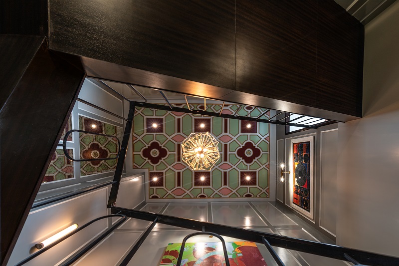
Home is named after the intent of providing the distinguished patrons an atmosphere of comfort and luxury reminiscent of their own drawing room where they can entertain and enjoy with their family and friends. Encompassing saleable artworks that portray jubilance, the place empowers an extraordinary style statement highlighted through vital components like vintage showpieces, a set of Elkington candlesticks, a sequence of planters sheathed against mirror back, granting an interminable look to the space.
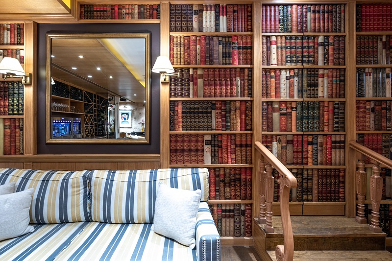
Furthermore, the area leads to a lounge ‘Den’ which wraps in itself an epitome of class. Its library, like exemplar, roots a long-lasting impression in the visitor’s mind. The theme of the place is based on contemporary style, but with some added elements from the modern concept like seating with striped pattern and the centrally located atypical coffee table. The place maintains the intrigue of the patron with the furniture serving as an assortment of colourful hues from all over the world. A very uniquely designed door here, that imitates a bookshelf, opens up to a distinctive expanse that cannot be envisaged by the patron.
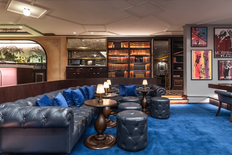
The city lacks a space that can provide entertainment along with an exquisite dining experience and PVR wanted to provide this to their niche clientele. The prime concept behind including a music lounge area was the client’s inclination towards the melodious realm. Thus, a double height space with cove lighting was introduced. The performance stage was composed with a bold red curtain, symbolic of the classy character that the entire layout poses for. Tending to curate an interactive schema, limited sofa seating has been provided just below the stage, encouraging the audience to be an integral aspect of the live performance. The entertainment of the guests was of paramount importance and thus the stage was born. The music lounge and stage was an inspired idea from jazz clubs of Europe that played host to artists from various genres the world over.
Moving inside, to the dining area, the design scheme brings to the fore an offbeat theme that narrates the story of a land far away. The walls are reminiscent of old British colonial homes with moulded panels and artworks bestowing an artistic feel all around. Low ceiling height being a crucial challenge, was deciphered by designing low height furniture imparting an illusion of height. The painstakingly detailed ceiling and engineered wood flooring adds up to the disposition of the area. To further amplify the magnificence that is imparted by the music lounge, the adjacent bar was laid out, decked in ambient lighting and a requisite euphoric ambiance. The bar compliments the music, with cocktails mimicking the variety and genre of music.
Stepping out of the dining, a vestibule contrived with stained-glass wall and wooden panelling leads the patron to the washroom area on its right. Bold colour palettes signify the metropolitan masculinity and hence have been utilized to formulate design of the Male washroom. Black and gold dominate the style of the private arena dedicated to them whereas blush tones has been chosen in the case of the Female washroom, with an added oomph of glow for a feminine touch. The wallpaper by De Gournay of France, perfectly sets the tropical ambiance with a fresh blush backdrop. On the left of the vestibule, is an exclusive lift lobby impersonating the entrance of a beautiful residence, modelling a London walk-up apartment. Black & white stone patterned flooring, green simplified casino chairs, tropical wallpaper from Ananbo vocalizes the style statement of the space. A stunning chandelier from Mud Studio in South Africa too dangles from the illustrious ceiling. The area is cladded with mirrors, giving the space an infinite look, adding a subtle yet exclusive persona to the entry. A carpeted staircase here, leads up to the terrace.
Al fresco Dining at the terrace invites users to a lush, fresh and vibrant ambience enhanced with a fancy chic character. Contrary to the enclosed spaces, the terrace houses arched windows and dashes of green with profound usage of wooden pergolas, supplementing the existing environ with an added essence of vitality.
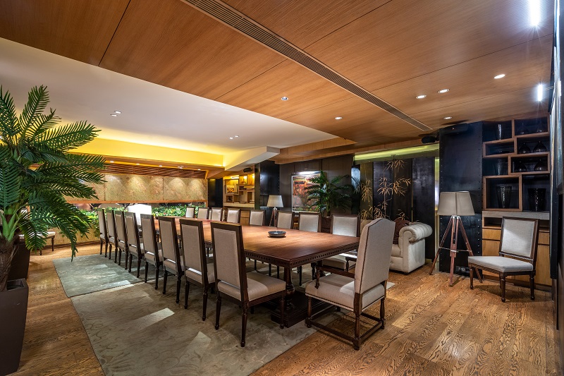
The divergent spaces have been introduced with varied yet apt lighting schemes. An amalgamate of dim and focused lighting has been utilized in the dining and bar zones, with the latter being used only on vertical interfaces to accentuate the exemplary pieces of art or wall décor. Contrary to this scheme, the bar on the terrace hosts a shower of glistening jar lights that render it in a spectacular panorama, in congruence with the enveloping greens.
The landscape design, observed as a part of the terrace floor, design aims to infuse connectivity between the built environments, the users and the natural environ circumscribed around us. With vertical planters as well as potted assets along the line of the walkway, the design makes a conscious effort to unveil the sustainable aspect of the structure. The presence of Spitalfields orangery, terrazzo Firenze & Spitalfields Toynbee, adds to the dynamism that the space stands as a stalwart for.
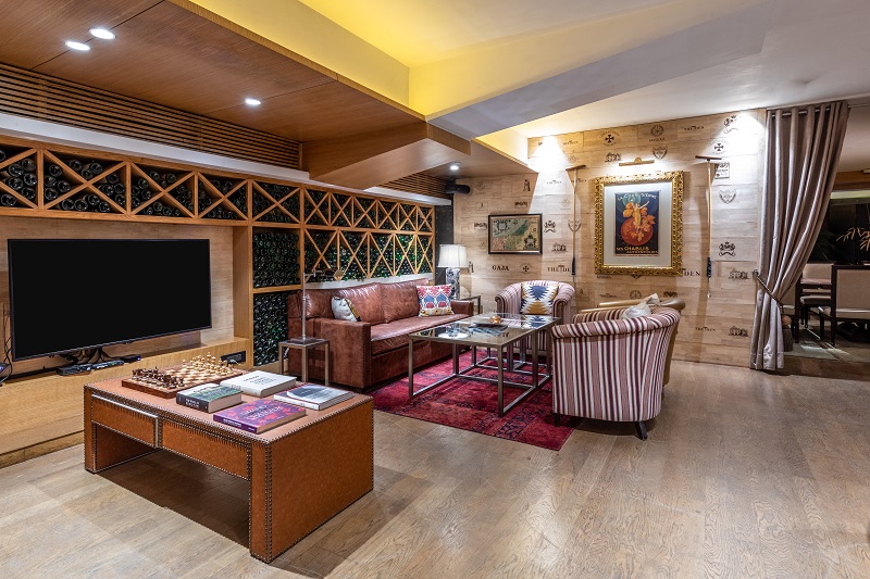
The furniture pieces range from contemporary to colonial, depending on the defined experience that the space has to offer. While a few of the bar stools and chairs were imported from Soane London, all sofas and tables incorporated in the den and ‘Sapphire’ (Music Lounge) were designed by the in-house production of DesignEx. While the walls pertain primarily to white tones, colour is infused into the scenario through the furnishing incorporated. Rounded up to a total of 110 in number, the seating varies in the configuration from booth style to segregated high chair set-up, in variant shades, complying with the prevalent palette of the space. For instance, the dining, adjacent to the music lounge, utilizes a splurge of mustard and vibrant blue furnishings while the bar comprises of smart cherry stools in a tropical theme.
‘HOME’ is an amalgamation of class and magnificence worth savouring. Possessed with a character of style and worldliness, this place is designed for an elite & well- travelled gentry, having exposure and who value the modishness and comfort of an extent. ‘HOME’, thus, not only offers a space to delve into an anomalous setting but also confers its users with an opportunity to experience a cacophony of essences, executed through this ostentatious design.


