The office entrance shapes the business’s essence and visitor’s perception. This project intricately fuses design with structural mastery, featuring exposed steel bars in a concrete wall, embodying organizational values, and fostering team unity. A vertical garden and ergonomic conference rooms infuse tranquility and efficiency, mirroring the client’s vision for a modern, sustainable workspace.
Q1. Can you elaborate on the significance of the office entrance in shaping the first impression of a business and its impact on visitors’ perceptions?
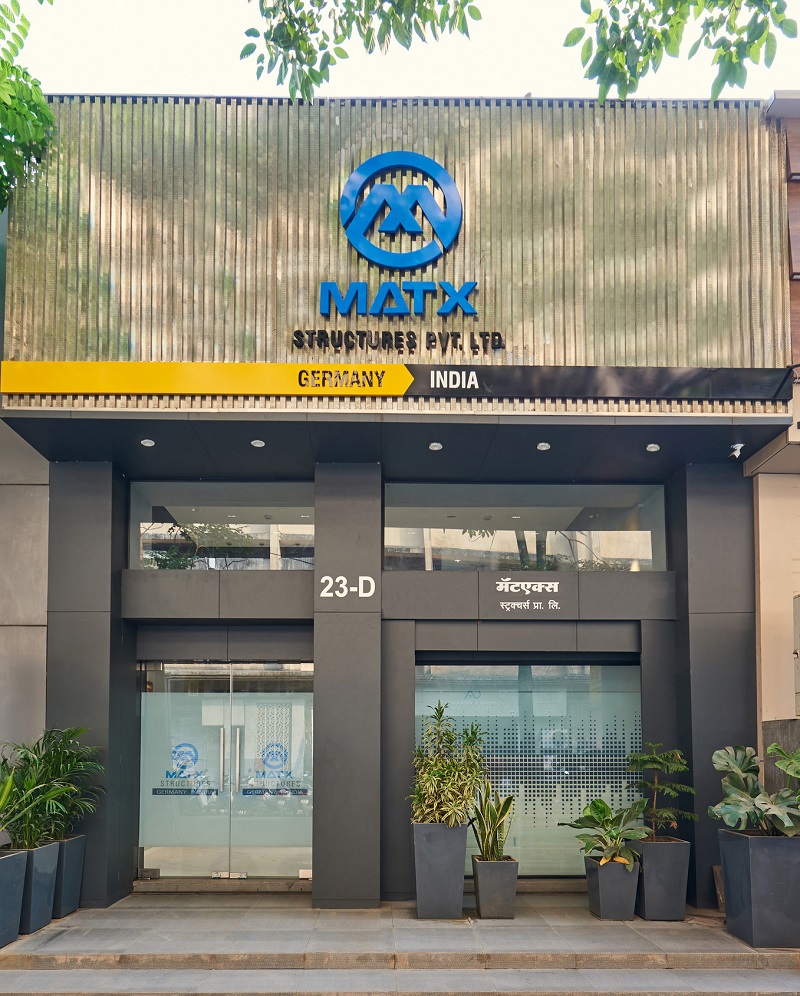
A1. The office entrance serves as the initial impression of the business, crafting a lasting tone in the visitor’s perception. Designing it meticulously becomes crucial. The entrance’s façade, characterized by clean squares and associated forms, symbolizes the essence of structures and engineering. This encompasses design, construction, and the client’s expertise in comprehensive solutions. The project’s design philosophy aims to subtly yet prominently reflect the civil construction domain. It serves as a voice for those within, conveying their purpose and aspirations.
Q2. How do the exposed steel bars and scaffolding rod bases in the design connect with clients conveying the client’s expertise and design philosophy?
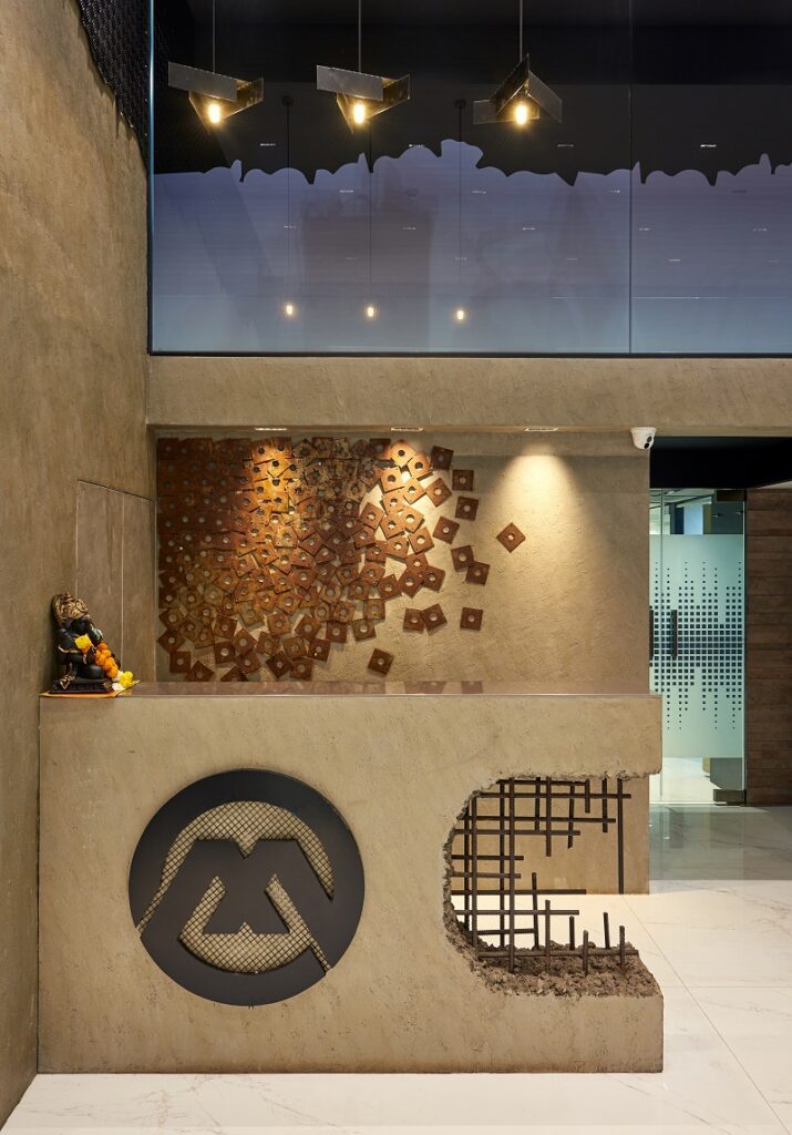
A2. The initial scene that shapes close interactions showcases exposed steel bars within an RCC wall, portraying the client’s fundamental focus on structural engineering and their objective of delivering robust, high-quality construction. Enhancing the reception area’s backdrop are the bases of scaffolding rods. Even in their simplest form, they exemplify the transformation of the ordinary into something extraordinary—a representation of sustainable design practices in the business.
Q3. How does the square geometry create symmetry, clarity, and unity in the corridor’s design, and how does this connect with the organization’s values?
A3. The corridor embodies symmetry, with squares as a recurring motif. These squares symbolize Competency, Consistency, Commitment, and Culture – the company’s core values. Square geometry brings unmatched symmetry, clarity, and unity, reflecting the organization’s deep commitment to these principles.
Q4. How does the transformation of the “I” into “We” in the design effectively convey the significance of teamwork in achieving successful outcomes?
A4. Towards the corridor’s end, our team motto of unity is subtly portrayed on a wall. A sequence of “I” gradually transforming into “We” signifies the shift from individual to collective efforts. This underlines that it’s the team, not an individual, that achieves outcomes. The letter “I” components are fashioned from repurposed metals, cut and polished, showcasing our commitment to sustainable design.
Q5. How does the vertical garden’s presence symbolize life in the concrete environment and align with the office’s design philosophy?
A5. Our approach involves envisioning functional and enduring design from the outset. The result is an office environment that exudes tranquility, offering a serene and inviting workspace that counterbalances the daily hustle. A vertical garden introduces a touch of greenery, symbolizing life amid the concrete and providing an instant sense of calm upon entering the space.
Q6. Could you share challenges encountered while designing the conference room, particularly in achieving a balance between aesthetics and functionality?
A6. Today, a conference room embodies the modern concept of team collaboration. Its design should prioritize privacy, inclusiveness, and an atmosphere that fosters productivity. My creation features a glass wall adorned with squares on one side and solid walls on the remaining sides, ensuring seclusion and concentration. Abundant lighting contributes to a positive ambiance. The selection of comfortable and ergonomic furniture is curated to enhance the posture and comfort of professionals during extended work hours.
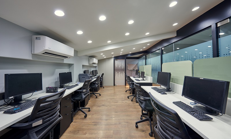
Q7. How does this design enhance the organization’s work culture and environment, especially regarding employee engagement, collaboration, and well-being?
A7. The design directive encapsulates the client’s essence, core values, business identity, and the artistic vision. Meticulously chosen materials and color combinations create a dynamic yet calming workspace. Emphasis on design, dimensions, and detailing ensures a spacious, luxurious environment. The design seamlessly achieves modernity, sustainability, and elegance within defined time, space, and budget parameters.
Functionality merges with symbolism, epitomizing teamwork and innovation. This narrative creates a sustainable, contemporary workspace, a true reflection of the client’s ethos.

